Tuesday, 28 May 2013

Creating Login, Registration and Logout pages

Registration Page :
  • Create a form with all the fields you require. 
  • Verify the form using javascript before sending it to server. 
  • Use method 'POST' to send the data which is better than 'GET' method.
  • Connect to database and store the data in the table created.
Login Page :
  • Create a form with login fields. You can use captcha too
  • Verify the form with javascript to check for blank data submissions.
  • Check whether username and passwords match. 
  • If they match, start the session and use a key (username) to reference the user.
  • Redirect to the home page of the user and get the details of the user using the session_variable (key/username).
Logout Page : 
  • As soon as the user clicks "logout" , kill the session. As soon as you kill the session, the stored key is killed. 


Note :
  • When the user tries to open the login page with out logging in, then check whether the session variable is empty. As the session variable is empty, redirect him to login page.
  • Check the above on every page which appears after login so that they cannot access the data with out logging in.
  • Avoid sql-injection by using mysql_escape_string().

Post your doubts as comments below

Friday, 24 May 2013

How to create and connect to MySQL database

Creating a MySQL Database, Table :


How to connect to the database created above in the video :

PHP Code : 
<?php
$con=mysqli_connect("localhost","root","","demo_sf");
if (mysqli_connect_errno($con))
{
echo "Failed to connect to MySQL: " . mysqli_connect_error();
}
?>


Code Explained :

mysqli_connect("server","username","password","database"); 
by default on localhost username = "root"  and password is ""

the if loop check whether the connection is made. If there is an error in the connect, it will display the error in the webpage [browser].


Thursday, 23 May 2013

Introduction to server scripting

PHP :

PHP (Hypertext Preprocessor) is one of the server scripting language widely used. It helps us to make dynamic and interacting web pages.

PHP script goes is placed between <?php  [code goes here] ?>

To communicate between HTML and PHP we generally use forms. There are two methods to collect the data from html, GET and POST.


Sample form : 

<form action="welcome.php" method="post"/"get"> // any one of post or get should be specified.
Name: <input type="text" name="fname">
Age: <input type="text" name="age">
<input type="submit">
</form>


GET Method : The information sent using "GET" method is visible in url. This method should not be used in sending  passwords and other sensitive information. It is not suitable to send very large variables.

Sample PHP code to retrieve data using GET :


Welcome <?php echo $_GET["fname"]; ?>.<br>
You are <?php echo $_GET["age"]; ?> years old!


POST Method : Information sent from a form with the POST method is invisible to others and has no limits on the amount of information to send.  

Sample PHP code to retrieve data using POST:

Welcome <?php echo $_POST["fname"]; ?>!<br>
You are <?php echo $_POST["age"]; ?> years old.


Note: $_REQUEST can be used for both POST and GET Method .

Sample PHP code using $_REQUEST :

Welcome <?php echo $_REQUEST["fname"]; ?>!<br>
You are <?php echo $_REQUEST["age"]; ?> years old.


Note : Validate form before sending the data to the server so that if any form is wrongly submitted is verified using javascript[browser] and not by php[server]. Hence reducing the server load. 


PHP Database :

MYSQL is widely used database with PHP. MYSQL runs on the server like PHP.

Step 1: Connect to MYSQL Server

PHP Code : mysqli_connect(host,username,password); 
Explained : In XAMPP  host is "localhost"

If username and password are not configured, then by default username is "root" and password is "" 

Step 2: Create a Database 
You can create a database at cpanel {MYSQL} or by using PHP code
PHP Code: http://w3schools.com/php/php_mysql_create.asp


Step 3:  
Creating a TABLE to store the data
Sample code : http://w3schools.com/php/php_mysql_create.asp

Step 4: Do stuff you need to do like inserting data,editing data,deleting data

Step 5: Close the connection 
Sample code : http://w3schools.com/php/php_mysql_connect.asp


Will upload a video on this very soon..


Please post your doubts or suggestions in the comment box below.


Thursday, 2 May 2013

CSS Positioning: A Comprehensive Look

One aspect of CSS layouts that will likely be around for some time yet is CSS positioning. That is, using CSS’sposition property. In this post, I’ll cover CSS positioning in detail and I hope you’ll come away from this with some more options in your CSS layouts.

Statically Positioned Elements

The first thing I’ll cover here is elements that are positioned statically. Here’s how this is done:
.example {
 position: static;
}
In most cases, however, this is actually completely unnecessary. The value static is the default, or initial value, for the position property. This means that, if you don’t declare a position value on an element, it starts out as “static”. So what does this value mean in terms of the element’s behaviour?
According to the spec, a statically positioned element is a “normal box”, laid out with what is referred to as normal flow. This means that a static element will be positioned based on its order in relation to other elements, flowing normally, with a change in behaviour depending on whether or not the element is block or inline. Other factors may also affect how a static element behaves, but, generally speaking, a static element’s behaviour is as straightforward as it gets.

Relatively Positioned Elements

Another possible value for the position property looks like this:
.example {
 position: relative;
}
So how is this different from a statically positioned element? A relatively positioned element behaves the same way as a static element, except that it is now subject to the values for four other CSS properties. Look at the following example:
.box1 {
    width: 100px;
    height: 100px;
    background: blue;
}

.box2 {
    width: 100px;
    height: 100px;
    background: green;
    border: yellow solid;
    position: relative;
    top: 20px;
    left: 20px;
}

.box3 {
    width: 100px;
    height: 100px;
    background: red;
}

.box4 {
    width: 100px;
    height: 100px;
    background: pink;
}
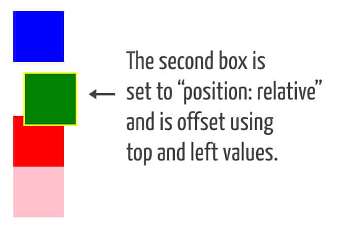
Assuming these four boxes are the only elements on the page, how will they behave? Well, first they’ll display on the page in the order they appear in the markup, with each box dropping to a new line. But the second box (the green one with the yellow border) will be offset from its original place because of the top and leftdeclarations. We could also use the bottom or right properties.
So the second box will be offset 20px from the top of its original spot, and 20px from the left of its original spot. You would get a similar effect if you added a top margin of 20px and a left margin of 20px – but with one significant difference: Offsetting the position with topleftbottom, or right does not affect the flow of the elements around it. Here’s a screen shot showing how the second box will look, as seen in this demo:
position: relative
As you can see, positioning an element relatively can cause overlap. And remember that the original space the element occupies is honored, but any offsets will not cause elements around the box to be repositioned.

Absolutely Positioned Elements

Here’s the third value you can use for the position property:
.example {
 position: absolute;
}
An element set to “position: absolute” is completely removed from the document’s normal flow, and, like “position: relative”, is subject to horizontal and vertical offsets using topleftbottom, and right.
But the main difference is the fact that it’s removed from the flow. This means the space originally occupied by the element will not be honored by surrounding elements. Surrounding elements will behave as if the absolutely positioned element is not even there.

POSITIONING CONTEXTS

When you offset a relatively positioned element, the offsets are relative to the element’s original place in the normal flow. But with an absolutely positioned element, the offsets are relative to the browser viewport, or, to oversimplify it, the whole window, or document body.
But the positioning context of an absolutely positioned element can be changed. This is done by adding “position: relative” to an ancestor element, thus creating a new positioning context. If that sounds confusing, here’s a demonstration.
And here’s a screen shot of the result:
position: absolute
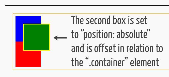
The body element is given a black border, and the “.container” element is given an orange border. This helps show that the green box (set to “position: absolute”) is offset in the context of the relatively positioned “.container” element.
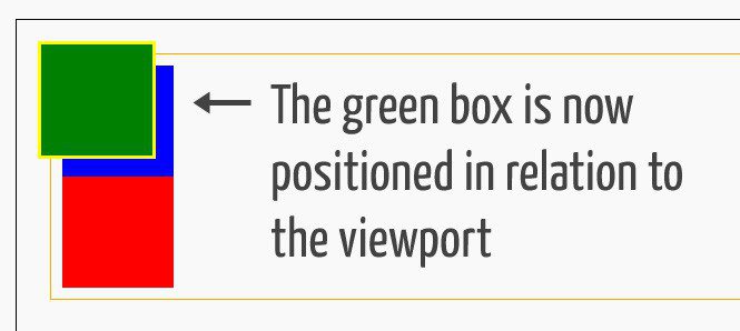
Notice what happens if we remove the “position: relative” declaration from the “.container” element:
Because we’ve removed the explicit positioning context, the green box is now offset in relation to the viewport. And, as mentioned, none of the surrounding elements are affected by the flow of the green box that has been removed from the normal flow.

Fixed Positioned Elements

Here’s the next available option for the position property:
.example {
 position: fixed;
}
A fixed position element, according to the spec, actually falls under the category of an “absolutely positioned” element. The behaviour of position: fixed is very similar to an element set to “position: absolute”, with two key differences: First, the positioning context is always the viewport, so the context won’t change by adding “position: relative” to a parent element. Second, fixed position elements will not move when the document is scrolled. Take a look at the screen shot below, taken from the Treehouse blog:
position: fixed
At the top of the page, a promo bar is shown that is fixed on the page, and it stays there even when you scroll. This is done using “position: fixed”. Using fixed positioned elements in combination with z-index, can help you layout and stack elements in unique ways, depending on what you’re trying to accomplish.


Source : http://blog.teamtreehouse.com/css-positioning
Wednesday, 1 May 2013

How to make a better layout using FLOAT, CLEAR, MIN-WIDTH, MAX-WIDTH, MIN-HEIGHT & MAX-HEIGHT?

            Understanding the "float" property in CSS can help you create a better layout for your web page. A better usage of "float" and "clear" can make your webpage layout more flexible to different resolutions.
            For example, you need to create a webpage, as shown in the figure, which should be more or less suitable in all major screen resolutions.


Step 1 :

Create an outer DIV with styling as follows :

HTML:

<!DOCTYPE>
<html>
<head><title>Layout Example</title>
<style>

           div{
                       border:1px solid #000; // This is just to make the DIVs visible with borders.
           }

           #outerDiv{
                       width:80%;
                       min-width:1000px;
                       max-width:1300px;
                       height:80%;
                       min-height:700px;
                       max-height:1000px;
                       margin:auto;
           }

</style>
</head>
<body>
           <div id="outerDiv">
           </div>
</body>
</html>

Code explained :
           The <!DOCTYPE> at the top of the document defines what type of attributes are to be allowed on the document. Here is a link for your reference.
            As you know that the width:80% allows the DIV to take up 80% of the window size as its width. Even when you re-size or use a screen of different resolution, it still takes up the 80% of the window size. This sometimes makes the contents of that DIV to overlap or mis-align with respect to your design. This can be corrected by using min-width and max-width
            Giving min-width:1000px, limits the resizing of the DIV to a minimum of 1000px instead of 80%. It means that when you resize (i.e., decreasing the window size or zooming in) the browser window, the DIV maintains the 80% width until a limiting value of 1000px, after which it does not resize but remains static.
            Similarly, giving max-width:1300px, limits the resizing of the DIV to a maximum of 1300px instead of 80%. It means that when you resize (i.e., increasing the window size or zooming out) the browser window, the DIV maintains the 80% width until a limiting value of 1300px, after which it does not resize but remains static.
            The similar concepts as of width property holds for height property too.
            Assuming that you understood our previous article on Horizontal Centering of DIV, I used the margin:auto for the same.

Step 2 :

Create 2 inner DIVs with styling as follows:

<!DOCTYPE>
<html>
<head><title>Layout Example</title>
<style>

div{
                       border:1px solid #000; // This is just to make the DIVs visible with borders.
           }

           #outerDiv{
                       width:80%;
                       min-width:1000px;
                       max-width:1300px;
                       height:80%;
                       min-height:700px;
                       max-height:1000px;
                       margin:auto;
           }
           #div1{
                        width:40%;
                       height:80%;
                       float:left;
           }
           #div2{
                       width:40%;
                       height:80%;
                       float:right;
           }

</style>
</head>
<body>
           <div id="outerDiv">
                      <div id="div1"></div>
                      <div id="div2"></div>
           </div>
</body>
</html>


Code explained :
            FLOAT is a very problematic property when used without a clear idea of its functionality. It is obvious that it makes an element to float to right or left depending on the value that it is assigned in the CSS. But it is sometimes overlooked that the floating element is actually considered by the parent DIV as an element hanging from its previous element, which in-turn results in the non-consideration of the height of the floating element. The following figure makes this clear:
            Float can also take "None" (which is default) and "Inherit" (which inherits the property from its parent). Note that, Float cannot be used for a Absolute positioned element.
            For further reference, check this link.
            This makes the following elements of the floating element to mis-align abruptly. I guess many of you have faced this problem. The solution to this lies just after the concept of FLOAT which uses the concept of CLEAR.


Step 3 :

            Creat a Dummy DIV with class clear and styling as follows:


<!DOCTYPE>
<html>
<head><title>Layout Example</title>
<style>

div{
                       border:1px solid #000; // This is just to make the DIVs visible with borders.
           }

           #outerDiv{
                       width:80%;
                       min-width:1000px;
                       max-width:1300px;
                       height:80%;
                       min-height:700px;
                       max-height:1000px;
                       margin:auto;
           }
           #div1{
                        width:40%;
                       height:80%;
                       float:left;
           }

           #div2{
                       width:40%;
                       height:80%;
                       float:right;
           }
           .clear{
                      clear:both;
           }

</style>
</head>
<body>
           <div id="outerDiv">
                      <div id="div1"></div>
                      <div id="div2"></div>
                      <div class="clear"></div>
           </div>
</body>
</html>

Code explained :
           CLEAR is very important property which is very much needed when FLOAT is used. This property actually clears the floating elements which are present before this element with the clear property and brings the height of the floating DIVs into picture. The CSS clear:both actually means that it clears the floating elements on both sides, i.e., on right and left sides.

   CLEAR can take the following values:

  • "right" (which clears the floating elements on the Right side)
  • "left" (which clears the floating elements on the Left side)
  • "none" (which doesn't clear anything and is Default)
  • "inherit" (which inherits from the parent element)
  • "both" (which clears on the both sides)
For further reference on clear, check this link.

           The above code will create a page as shown :


           As the div1 and div2 are always floating to left and right respectively, they will always be aligned as such whatever the width of the outerDiv may be. To maintain this, the width of the div1 and div2 also matters. To avoid this, we gave their width and height in percentage which allows them to adjust according to the parent.
           Finally removing the border for the DIV with class "clear", we get our required layout for almost all kinds of screen resolutions.

           This code is made active in this link for your reference. Observe the page by resizing the window.

           I hope you got a basic idea on creating a good layout using Float, Clear, Min-width, Max-width, Min-height & Max-height. Please comment if you have any doubts or anything to share.

           Thank you.

Horizontal Navigation Bar

Horizontal Navigation Bar is one of the most used navigation bars. Following few basic points, its very easy to build horizontal navigation bar. 

Step 1:
First Create a Un-order list of  navigation links.


Sample Code :    
<ul>

<li><a href="#">Home</a></li>

<li><a href="#">Gallery</a></li>

<li><a href="#">Contact</a></li>
<li><a href="#">About</a></li>
</ul>

The Above Code looks like :
  • Home
  • Gallery
  • Contact
  • About Us

Step 2:
Edit the list-style type and text-decoration of links. Changing list-style-type  of li to none removes the black dots. Changing the text-decoration of links to none removes the under line below the links.

Sample Code :

ul
{
list-style-type:none;
}

{
text-decoration:none;
color:red;//Use color of your choice
}

Adding the above style to the HTML code in step one will look like :
Home
Gallery
Contact 
About Us

Step 3:
Now aligning them horizontally. We can do this in many methods. Two most commonly used methods are explained below

Method 1: Assign float left to all 'li' elements                    [li{float:left;}]
Method 2: Assign display:inline to all "li" elements         [ li{display:inline}]

Adding this code will look like :
Home  Gallery  Contact  About Us

Step 4: (Creating tabs)
Change the padding and margin of li elements to 0px (Zero) because when we click anywhere on the tab, it should respond. If we dont set the padding and margin to 0px, only the text element responds when clicked not the complete tab. Add background color, padding ,margin  to 'a' (Link) element according to your requirement. You are good to go.


Vertical and Horizontal centering of a div


Centering a div horizontally means placing the div in the center of the parent div in vertical direction. 


Sample Code :

<html>
<head>
<style>
#vertical{
  position:relative;
width:120px;
height:100px;
top:50%;
left:50%;
margin:-50px 0 0 -60px;
background-color: yellow;
}
</style>
</head>
<body>
<div id="vertical">
Vertically centered div
</div>
</body>
</html>

Code Explained :

top: 50% is setting the div at a distance of 50% of the parent div height from the top. 
left:50% is setting the div at a distance of 50% of the parent div width from the left.
margin: -50px 0 0 -60px is setting the div at -50px from the top of the parent div and -60px from left of the parent div. We have chose -50px and -60px as they are half the height and width of the div respectively. 

Setting -[negative]px implies that setting the div in the opposite direction. In the above example setting -50px from top means lifting the div 50px in the top direction.

margin:[top] [right] [bottom] [left] is the format. All the margins can be set in a single line.

Position should be specified. Height and Width should be specified.


Post your doubts and suggestions in the comment below

Horizontal Centering of a div


Centering a div horizontally means placing the div in the center of the parent div in horizontal direction. This can be done in many ways. One of the simple and commonly used method is explained below.

Sample Code:

<html>
<head>
<style>
#horizontal{
height:100px;
width:100px;
background-color: Yellow;
position: relative;
margin-left: auto;
margin-right: auto;
}
</style>
</head>
<body>
<div id="horizontal">
Horizontally centered div
</div>
</body>
</html>

Code Explained:

Setting margin-left and margin-right to auto is important for this horizontal centering of the div named "horizontal". Here the parent of "horizontal" div is body of the page. "horizontal" div is placed in the horizontal center of the body of the page.

                       There are few important things to note here. The position of the div should be relative to the parent because the div is placed in the center of the parent element relatively. Secondly width of the div should be specified. If width of the div is not specified the div assumes complete width of the parent .  If the div has the same width of the parent element then its automatically aligned at the center and it would be meaning less to set margin-left and margin-right to auto.
Perfectly placed at the center of body

When the div assumes the width of the parent

When the position of the div is absolute


Post your doubts and suggestions in the comments below

Hosting a site on 5gbfree.com (For newbies)

This tutorial is for newbies. People who know how to host a site in cpanel can skip this.

Step 1:
Go to http://5gbfree.com and click "SIGN UP FREE" button. You will be directed to signup page.

Step 2: 
Make sure that you enter correct email address because the confirmation will be sent to the given email email id. User name should not be more than 8 characters and try to use only alphabets. Username should not contain any spaces and the username will be domain name of your site. Your domain address will look like http://[username].5gbfree.com.


 As soon as you click "Create your account" a confirmation mail is sent to the email address provided.


Step 3:
When you confirm the email id by clicking the link provided you will see the verification page like the picture below. The login credentials of your cpanel is mailed to your email when you verify your email id.


Step 4:
You can either fo to http://5gbfree.com/login or http://[your user name].5gbfree.com:2082 to login to your cpanel. Use the login and password sent to your mail.


Step 5:
After entering the cpanel, you can skip the tour. Find a folder named "File Manager" under "Files section"


On clicking on "File Manager" a window pops up. Select the option "Web Root" and hit "Go".


Step 6:
Now create a new folder by clicking on New Folder option in the tool bar. 


A window pops up asking to name the new folder. Name what ever you want. Try to avoid spaces. Instead of space you can use "_"  character. It is a good grammar not to use spaces thought there is no restriction in using spaces. After you name the folder hit "Create New Folder".


Step 7:
After creating new folder make sure that you are in that folder. Then click the upload button in the tool bar. Then a new tab opens as shown in the picture below. Click on "Chose File" button. Don't change the permissions. The permissions should be same the permission shown in the picture below. You will learn more about this permissions later.


When you click on "Chose File" a window pops. Chose the files you need to upload. Note that you can upload only one file at a time. 


At the bottom right of the screen you can see the upload progress.  When all the files are uploaded you can either close that tab or click on " Back to Home/-----".


Once you see the files in the newly created folder than the upload is done. 


Final Step:
The URL a this website would be http://[username].5gbfree.com/[Name of the folder created]. If you have used spaces in the name of the folder like "Spring Fest" then the URL would be http://[username].5gbfree.com/Spring%20Fest. Note that instead of space when used "%20".

This is more over same procedure for any hosting sites. 


Post your doubts as comments below.